A big thanks to all of you who took the time and effort to participate in our survey. The survey was launched on 16 January this year, and was concluded on 6 April. A total of 46 fully completed questionnaires were received.
The majority (87%) of survey respondents were male, and 72% were in the 31 to 50 age group, the largest block (39%) were from 31 to 40 years of age. The third largest block (24%) of respondents were 30 years old or younger.
The survey questionnaire was designed to be simple, easy and quick to complete encourage broad participation. It was limited to six open ended questions in order to capture a wide range of ideas from members.
Here’s what members said, summarized and tabulated by frequency of certain words or phrases being mentioned.
Q1. What is the one image that comes to your mind when the word triathlon is mentioned?
|
Triangle |
18% |
|
Graphics of Swim, Bike and Run |
17% |
|
Circles |
9% |
|
The word “TRI” |
7% |
Q2. What is the one image that comes to your mind when the word “Hong Kong” is mentioned?
|
Bauhinia flower |
24% |
|
The word “HK” or “香港 “ |
13% |
|
Hong Kong skyline, Victoria Harbor, IFC Tower, Skyscrapers, etc. |
13% |
|
Chinese Sailing Junk |
11% |
|
Hong Kong SAR Flag |
9% |
|
Arrow |
9% |
|
Dragon |
7% |
|
Frog (the figurative shape of HK Island) |
4% |
Q3. Please describe what you like about the current HKTriA logo:
|
Symbolic of our Sport’s 3 disciplines |
39% |
|
Simplicity |
11% |
|
Colorful |
7% |
Q4. Please describe what you dislike about the current HKTriA logo:
|
Too outdated, old fashioned, old school, very 1970’s |
15% |
|
Human stick figures look too complicated |
15% |
|
Color combination not good, boring or not professional |
11% |
|
Letters are too small or not large enough |
9% |
|
Lack of Hong Kong element, identification or linkage |
4% |
|
No Comment, or No Idea |
31% |
Q5. If you had to choose a color or colors to represent Hong Kong, what would it/these be?
|
Red |
78% |
|
Blue |
26% |
|
White |
24% |
|
Green |
17% |
|
Black |
11% |
|
Gold |
9% |
Q6. Please feel free to share any other comments, suggestions and ideas that you may have.
|
Representation of Swim, Bike & Run, or Multisport |
13% |
|
Consult professional designers |
7% |
|
No Comment |
54% |
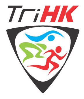
I think we can make some observations from the logo survey results. Firstly, there appears to be a consensus that our logo can be improved and modernized. The colors and graphics can be made to look better, and a uniquely Hong Kong identity can be incorporated into our logo. It appears that red is the most popular color, and the bauhinia flower is the most recognized symbol of Hong Kong, not surprising as these are the fundamental elements of the Hong Kong SAR flag. Some have mentioned that the color red represents “Lai See”, which I guess is a very important part of our culture, something we always look forward to every new year, and perhaps we subconsciously wish for it as the prize at the finish of our races. The triangle is the geometric shape that is most frequently cited to represent triathlon, followed by circle or circles as symbol of triathlon. Again this is logical given that many national triathlon federations in other countries have adopted triangles in their logos, the International Triathlon Union (ITU) uses the three circles or rings for its logo, and of course the Olympic symbol of five interconnected color rings is universally recognized.
Once again, thank you for your comments. This survey has been a very useful exercise in gathering the opinion and ideas of members. We will incorporate your views and suggestions as we work towards redesigning our logo to make it a more attractive icon, that all of us will be proud of being identified with; that corporate sponsors will find valuable for their brands and companies to be associated with; and that we are easily recognized in international races and events as “Triathlon HK”. |
 Gallery


